You’ve Got Mail
By Laken Avonne Rapier

Email consumes America today; email is evolving into essentially a whole new unspoken language and ultimately changing the face of marketing. Many businesses and organizations have found email to be nothing but beneficial to the bottom line providing an inexpensive medium to grow revenue and increase profit margins. With increasing competition in a sluggish economy more and more companies are turning to email as a cost effective means of advertising and in turn growing their revenue stream and operating profit (Boerema). Email is accessible and easy for all generations to navigate, but ensuring the message is concise, targeted to the appropriate audience, and providing a true call to action is not simple. Some people consider advertisements via email ‘spam’. Others look at them as less junk mail in their traditional bricks and mortar mailbox, more trees that live, a convenience and fabulous distraction to their electronic mailbox. Advertisers and marketers alike praise email for saving them not only money but also resources (Boerema). When making a purchase online, they use your email for not only an electronic receipt but also a way to inform you of more “exclusive offers and opportunities to save,” thus adding you to their mass email list and potential ongoing revenue stream.
Steps to a Creating a Successful Email Advertisement
1. Conceptualize the Advertisement: Define your market, target audience. This can be national, world-wide, or local. Write down exactly what you want the reader of this email to understand which normally includes date and time of sale and define sale offerings and/or coupon or rebate offer.
2. Create the Eye-Catching Subject Line or “Big Promise”: The subject line is vital to the email getting read. The phrase in the subject line forms the first impression with the reader and determines if your advertisement sinks or swims. Keep it short and to the point, yet believable and enticing. This step can be interchangeable and can be done whenever that perfect little phrase pops in your head. Simply write it down and save it for the most effective use. Here is a website of words that are proven to be successful and catch a reader’s eye -http://www.majon.com/safeannounce/emailwords-majon2.html
3. Create a balanced color scheme: Bright, vivid colors typically capture the viewer’s eye by including various fonts, font sizes and colors which add variation to the advertisement while highlighting specific content within the advertisement. Bold or underline words that you feel would hook the potential consumer (see examples highlighted below).
4. Gather research: Send a “test” email to yourself, a colleague or test group to ensure it appears how you want it on screen, ensure that no errors are made, and that it has the anticipated effect desired. Check spelling and ensure size, font, and colors are appropriate. Make sure the pictures appear and are properly sized to maximize the ad and ensure any links added work properly. Validate assumptions that the advertisement created will result in additional sales or a call to action.
5. Test Effectiveness: Ensure success of an effective email marketing campaign by including the following components: a targeted mailing list or lists, a strong call to action subject line, eye catching content with links and features that are user friendly and easy to use. It is always best to test the advertisement with research groups, surveys or focus groups which can validate assumptions and allow for adjustments to maximize exposure and effect.
Do’s and Dont's
· Do use bold words that entice the reader to make an impulse act such as free, act now, today only.
· Do vary the font size to highlight specific words to create a greater call to action.
· Do change the color of certain words to make that word pop!
· Do use pictures. They really do say a thousand words.
· Do include a link to your website/online store.
· Do add company contact information, which should always be readily accessible.
· Do not make the advertisement too busy as ‘less is more’.
· Do not use every color of the rainbow.
· Do not over use exclamation points!!!!!!
· Do not type a novel as your message will be lost.
Examples -
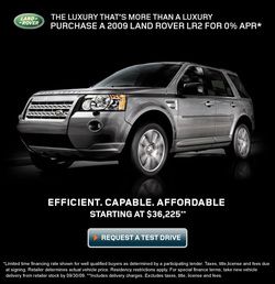
This advertisement showcases the product by making it the largest image in the ad and includes price, features, and the company’s logo. In this example, the car practically jumps off the page. While the ad focuses the reader’s attention on the luxury of the vehicle, it also ensures the potential customer knows that the vehicle is clearly luxurious, yet affordable and efficient. The ‘Request A Test Drive’ is a good example of a call to action which includes a link to the dealership nearest you prompting and urging you to do just that.
http://www.landrover.com/gl/en/lr/marketsel
http://www.landrover.com/gl/en/lr/marketsel
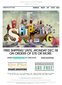
This advertisement showcases free offerings to drive consumers to their website. This is a common feature for retailers to ease the minds of their customers that purchasing on-line can be easier than going to a ‘real’ store by showcasing free shipping, free returns and free exchanges. In this example, the artwork was created to highlight all the call to actions and notice the color variation, font size variation along with the variation of font selection. Clearly, the coupon or discount word ‘FREEBIRD08’ and the hyperlink, start shopping, are in the middle of the page and prominently displayed.
http://www.urbanoutfitters.com/urban/index.jsp
http://www.urbanoutfitters.com/urban/index.jsp

This advertisement showcases the Company’s history and heritage with the anniversary celebration sale. By use of a panoramic photo, the image clearly captures a large variety of products and design expertise and the highlight cyan font color draws the reader the text the designer chooses to highlight combining both the celebration of the event and the ‘cool’ offer. It is crisp and clean, almost sparkling with a simple sophistication.
http://www.studiosnaidero.com/
http://www.studiosnaidero.com/

This advertisement draws upon the three word name of the Company defining each independent name with a fashion sense and ‘shop now’ feature begging the consumer to identify with one of the characters and beginning shopping at the click of a mouse. The ad also shows that this is a Spring Collection, so it urges the consumer to get what is now in style and will appeal to those interested in the latest trends with the ‘new arrivals’ button. While less variation in color and font style, the appeal is in the identification with the model and the casual to flirty to more dressy looks all showcased in a standard color template that is still eye catching.
http://www.natashaelise.com/PM.php
http://www.natashaelise.com/PM.php
| genre analysis - email advertisements.doc.docx |
